Basic Elements of Design
1. Line
The main and most basic element of the plan is the line. In drawing, a line is a pen or pencil stroke, but in graphic design it is any two connected points. Lines help separate spaces and draw attention to specific areas.
2. Shape
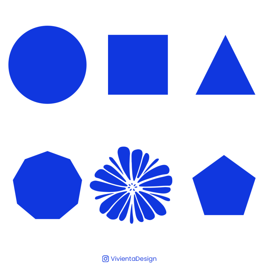
Geometric or organic shapes are intriguing. A shape is defined by a boundary. B. Line or Color. Often used to emphasize parts of the page. Ultimately everything takes shape, so you should always think about how the different elements of your design take shape and how those shapes interact.
3. color
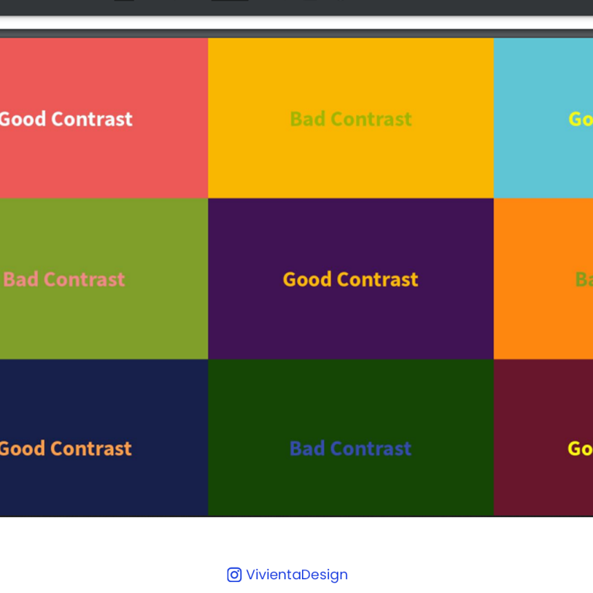
Color is the most important design element. Improper coloring often leads to disaster. Even if your design is pure grayscale, you need the right balance and contrast.
Colors create moods and can say different things depending on their connotations. Colors can emphasize certain areas of a design layout.
4. Space
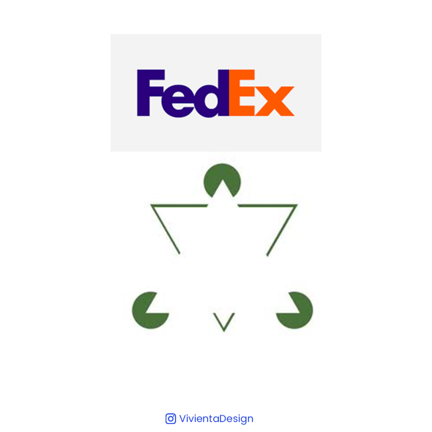
Negative space is one of the most underutilized and misunderstood aspects of page design. Areas left blank, whether white or any other color, help create a big picture. Use negative space to create shapes as you would any other element. Read this article if you want to learn about common design terms like negative space.
5. Harmony
Harmony occurs when all design elements come together to form the main concept of the design. Harmony is about organizing every aspect of your design with the final message you want to convey.
6. Typography
Typography plays an important role in setting the mood of your design. Typography is not only words, but also the way they are written. Typography can enhance the balance of a logo. If you use only typography to create your logo, you can also make your logo more impressive.
7. Size (scale)
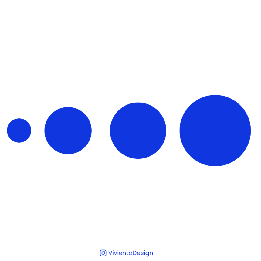
Scale refers to the size of an object. little scale differences are considered appropriate for professional content. In other words, it indicates how big or small an object is. Changing the scale of an object can add visual interest.
When you are designing a piece, size plays an important role in making a layout functional, attractive and organized.
There are hundreds of rules and many more when it comes to creating beautiful designs on and off the web, but these principles are the foundation for making what you create beautiful, professional, and perfect. It's a basic matter. We highly encourage you to continue your learning path by checking out this infographic of important dos and don'ts in graphic design.
Don't Forget To Hit The Like Button.....

